9.5 Person [Deprecated]
Label Colors
In order to obtain the colors blue and rose in the chart representing the gender distribution,
add the following JSON entry to the JSON object of the JSON Metadata field on the edit dashboard page:
"label_colors": {
    "Male": "#3366FF",
    "Female": "#FF3399"
}
CSS
To hide the dashboard header insert the following css code to the CSS field on the edit page:
.dashboard > div:not(.dashboard-content) {  /* dashboard header */
  display: none;
}
With this every time you want to edit the dashboard layout you have to either comment the CSS inserted or remove it so the “Edit Dashboard” button can show again.
Data Source Filter
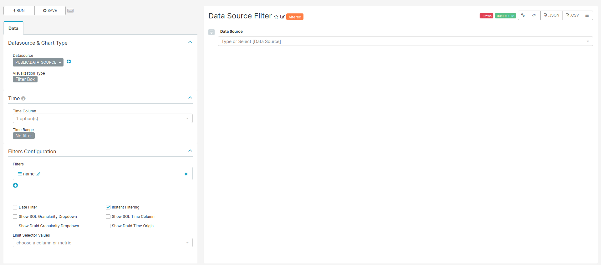
Figure 9.8: Settings for creating the Data Source filter chart
For the filter to work the name of the fields to filter should match in all tables used on the charts of this dashboard.
SQL query
No SQL query, use the sql table data_source of the achilles database.
Chart settings
- Data Tab
- Datasource & Chart Type
- Visualization Type: Filter Box
- Time
- Time range: No filter
- Filters Configuration
- Filters:
- name
- Date Filter: off
- Instant Filtering: on
- Filters:
- Datasource & Chart Type
Age at first observation - Table {#age1ObservationTable}
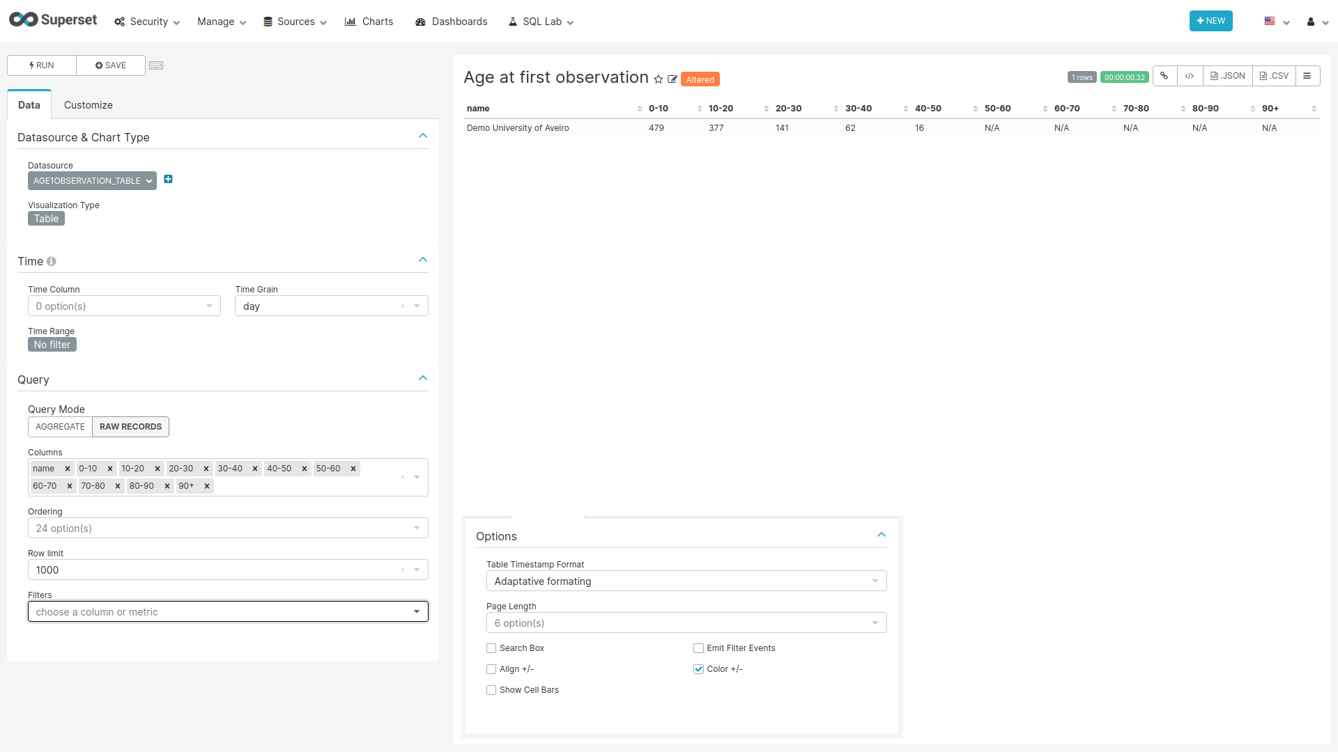
Figure 9.9: Settings for creating the Age at First Observation Table chart
SQL query
SELECT source.name,
       source.acronym,
       SUM(CASE WHEN CAST(stratum_2 AS INTEGER) < 10
         THEN count_value END) AS "0-10",
       SUM(CASE WHEN CAST(stratum_2 AS INTEGER) >= 10
         AND CAST(stratum_2 AS INTEGER) < 20
         THEN count_value END) AS "10-20",
       SUM(CASE WHEN CAST(stratum_2 AS INTEGER) >= 20
         AND CAST(stratum_2 AS INTEGER) < 30
         THEN count_value END) AS "20-30",
       SUM(CASE WHEN CAST(stratum_2 AS INTEGER) >= 30
         AND CAST(stratum_2 AS INTEGER) < 40
         THEN count_value END) AS "30-40",
       SUM(CASE WHEN CAST(stratum_2 AS INTEGER) >= 40
         AND CAST(stratum_2 AS INTEGER) < 50
         THEN count_value END) AS "40-50",
       SUM(CASE WHEN CAST(stratum_2 AS INTEGER) >= 50
         AND CAST(stratum_2 AS INTEGER) < 60
         THEN count_value END) AS "50-60",
       SUM(CASE WHEN CAST(stratum_2 AS INTEGER) >= 60
         AND CAST(stratum_2 AS INTEGER) < 70
         THEN count_value END) AS "60-70",
       SUM(CASE WHEN CAST(stratum_2 AS INTEGER) >= 70
         AND CAST(stratum_2 AS INTEGER) < 80
         THEN count_value END) AS "70-80",
       SUM(CASE WHEN CAST(stratum_2 AS INTEGER) >= 80
         AND CAST(stratum_2 AS INTEGER) < 90
         THEN count_value END) AS "80-90",
       SUM(CASE WHEN CAST(stratum_2 AS INTEGER) >= 90
         THEN count_value END) AS "90+"
FROM public.achilles_results AS achilles
INNER JOIN public.data_source AS source
  ON achilles.data_source_id=source.id
INNER JOIN public.concept
  ON CAST(stratum_1 AS BIGINT) = concept_id
WHERE analysis_id = 102
GROUP BY name, acronym
Chart settings
- Data Tab
- Datasource & Chart Type
- Visualization Type: Table
- Time
- Time range: No filter
- Query
- Query Mode: Raw Records
- Columns: name, 0-10, 10-20, 20-30, 30-40, 40-50, 50-60, 60-70, 70-80, 80-90, 90+
- Datasource & Chart Type
- Customize Tab
- Options
- Show Cell Bars: off
- Options
Age at first observation - Bars {#age1ObservationBars}
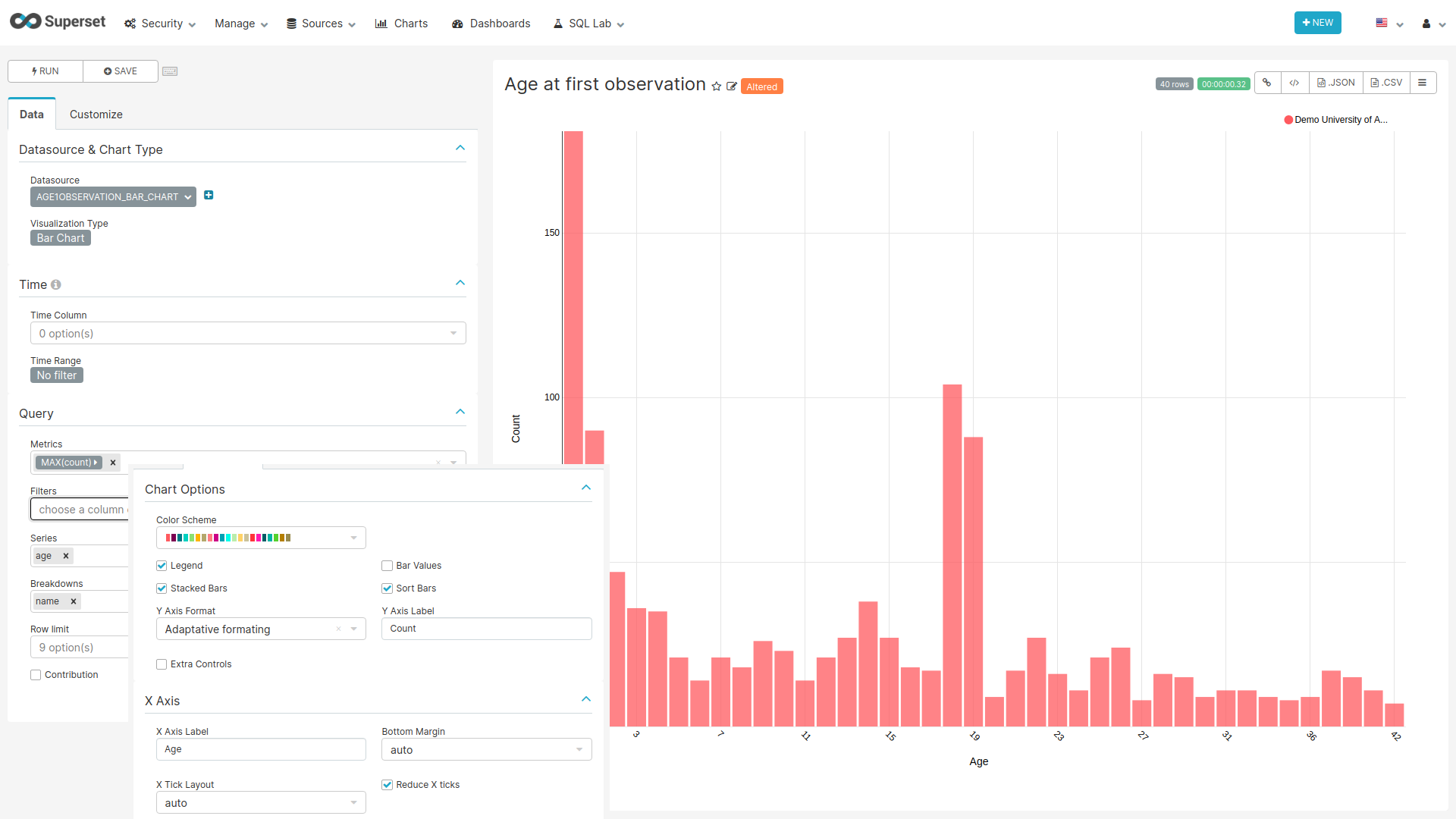
Figure 9.10: Settings for creating the Age at First Observation Bar chart
SQL query
SELECT source.name,
    cast(stratum_1 AS int) AS Age,
    count_value AS count,
    source.acronym
FROM public.achilles_results AS achilles
INNER JOIN public.data_source AS source
  ON achilles.data_source_id=source.id
WHERE analysis_id = 101
Chart settings
- Data Tab
- Datasource & Chart Type
- Visualization Type: Bar Chart
- Time
- Time range: No filter
- Query
- Metrics: MAX(count)
- Series: age
- Breakdowns: name
- Datasource & Chart Type
- Customize Tab
- Chart Options
- Stacked Bars: on
- Sort Bars: on
- Y Axis Label: Count
- X Axis
- X Axis Label: Age
- Reduce X ticks: on
- Chart Options
Year of Birth {#yearOfBirth}
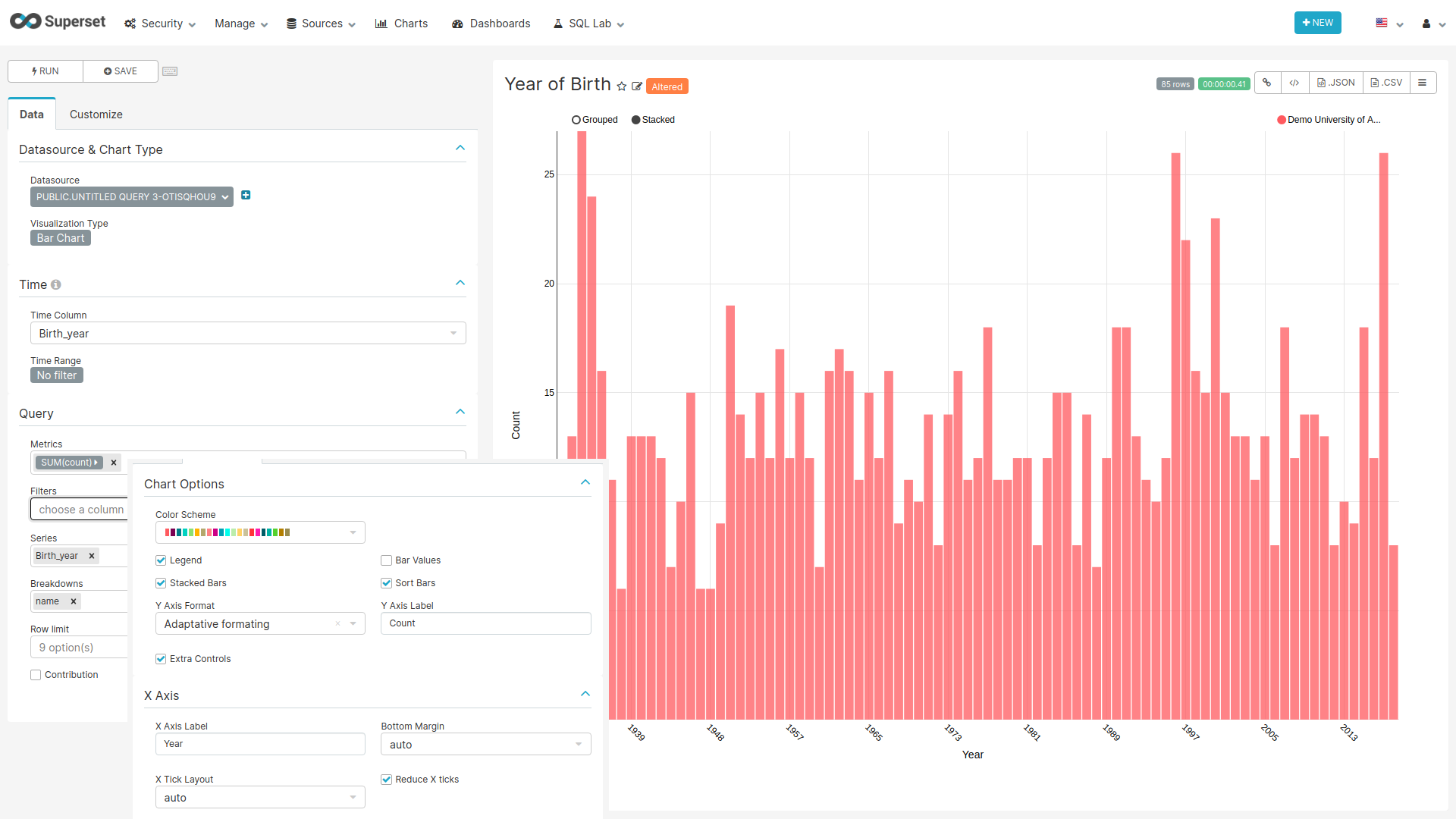
Figure 9.11: Settings for creating the Year of Birth chart
SQL query
SELECT source.name,
       source.acronym,
       stratum_1 AS "Birth_year",
       count_value AS count
FROM public.achilles_results AS achilles
INNER JOIN public.data_source AS source
  ON achilles.data_source_id=source.id
WHERE analysis_id = 3
Chart settings
- Data Tab
- Datasource & Chart Type
- Visualization Type: Bar Chart
- Time
- Time range: No filter
- Query
- Metrics: SUM(count)
- Series: Birth_year
- Breakdowns: name
- Datasource & Chart Type
- Customize Tab
- Chart Options
- Stacked Bars: on
- Sort Bars: on
- Y Axis Label: Count
- Extra Controls: on
- X Axis
- X Axis Label: Year
- Reduce X ticks: on
- Chart Options
Gender
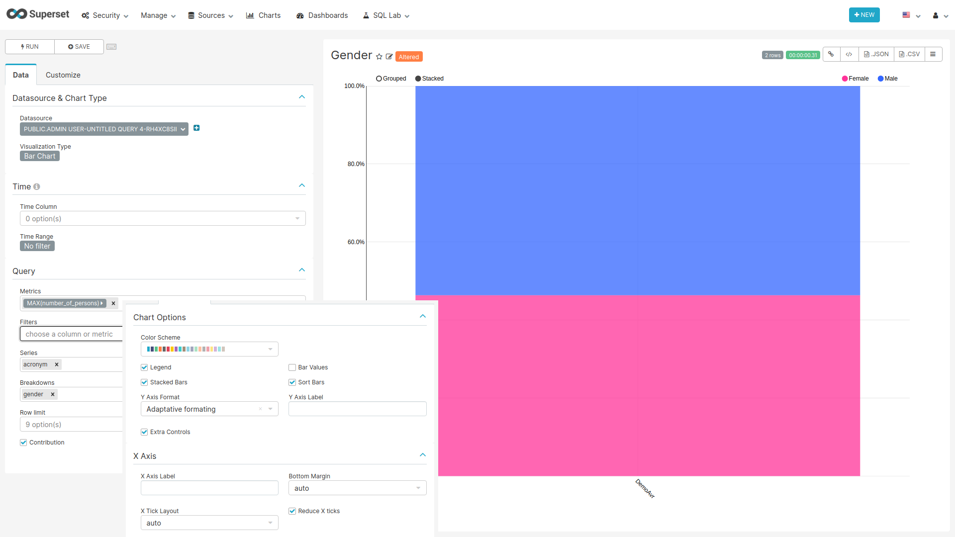
Figure 9.12: Settings for creating the Gender chart
SQL query
SELECT source.name,
       concept_name AS Gender,
       count_value AS Number_of_persons,
       source.acronym
FROM public.achilles_results AS achilles
INNER JOIN public.data_source AS source
  ON achilles.data_source_id=source.id
JOIN (
  SELECT '8507' AS concept_id, 'Male' AS concept_name
  UNION
  SELECT '8532' AS concept_id, 'Female' AS concept_name
) AS concepts ON achilles.stratum_1 = concept_id
WHERE analysis_id = 2
Chart settings
- Data Tab
- Datasource & Chart Type
- Visualization Type: Bar Chart
- Time
- Time range: No filter
- Query
- Metrics: MAX(Number_of_persons)
- Series: acronym
- Breakdowns: gender
- Contribution: on
- Datasource & Chart Type
- Customize Tab
- Chart Options
- Stacked Bars: on
- Sort Bars: on
- Extra Controls: on
- X Axis
- Reduce X ticks: on
- Chart Options